


Choosing the right tiles for the kitchen is crucial for the overall appearance of the interior – the wall above the countertop often draws attention first. If you're wondering how to match the color of the tiles to kitchen furniture to create a cohesive look and highlight your kitchen's unique character, this guide will walk you through the key principles.
In this article, you'll learn how to match tiles to furniture to ensure the interior looks harmonious while being easy to clean daily. It's worth opting for solutions that last for years and make your kitchen feel truly comfortable.
How to choose tiles – analyzing the kitchen style as a starting point
Before deciding which tiles to choose and what color of tiles will go best with your furniture, pay attention to the interior style. This determines whether light, gray, or beige tiles, or perhaps glossy tiles in a glamorous style, will work best in your arrangement.
Modern arrangements often feature shades of gray, white, and smooth-surface tiles
In rustic kitchens, beige tiles or models that imitate natural stone work perfectly.


If you have light or wooden furniture in a Scandinavian style, you can choose kitchen tiles in a similar tone to create a cohesive look without overwhelming the space.
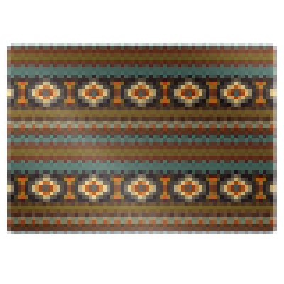
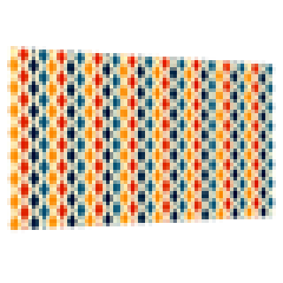
For black or gray kitchen furniture, selecting tiles with interesting patterns or in bold colors, such as bottle green or copper brown, can add energy and character to the interior.
Analyzing the style helps you determine right away which tiles will be the perfect choice to make your interior look aesthetic and harmonious.
How to choose the right tile color? Contrast vs. cohesion
When considering how to match the color of tiles to kitchen furniture, one of the most important decisions is choosing between contrast and cohesion. Both approaches can be a great choice – it all depends on the interior style, room size, and the effect you want to achieve.
If you have light furniture or a kitchen in white tones, you can opt for dark tiles to add elegance and depth to the arrangement.
For white kitchen furniture, tiles in bottle green, graphite, or copper brown will beautifully break the monotony and add character to the interior.
If you want the kitchen to have a cohesive look, choose kitchen tiles in a tone similar to the furniture fronts.
Wooden furniture looks great with tiles in warm beige tones, while gray kitchen furniture pairs well with light tiles or marble-effect tiles.
Modern arrangements often emphasize a uniform, harmonious palette – such a solution visually organizes the space and makes the kitchen appear softer and more elegant.
Light or dark tiles – how they affect the kitchen's perception
Matching tile colors to kitchen furniture is one thing, but it's equally important to determine whether light or dark shades are the better choice.
Light tiles – beige, white, pastel pink, or light gray shades – visually enlarge the space, making them ideal for small kitchens or spaces with limited natural light. Combined with light furniture and a wooden countertop, they create a light, pleasant atmosphere that adds freshness to the interior.
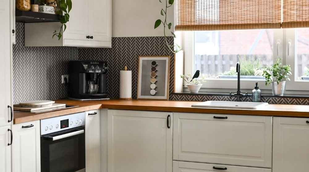
Dark tiles, such as graphite, black, or intense bottle green, perfectly complement trendy, modern arrangements. They create an elegant effect and add depth and expression to larger spaces. They pair well with black furniture, creating a refined minimalist effect. However, keep in mind that dark colors may highlight dirt more easily, so pay attention to the ease of cleaning and the tile's structure – tiles with subtle patterns or a slight gloss are often more practical for everyday use.
The importance of lighting in perceiving tile colors
When trying to match tile colors to kitchen furniture, it's easy to focus solely on the tiles and furniture themselves, but lighting also plays a crucial role. It's the light – both natural and artificial – that can alter shades, highlight textures, and even completely change how tile patterns are perceived.
In a small kitchen with limited natural light, light or beige tiles can brighten the space and add lightness. On the other hand, if your kitchen is spacious and well-lit, you can opt for darker colors or marble-effect tiles, which will reveal elegant, natural reflections under proper lighting.
Consider the type of light:
Warm light can warm up white and beige tones
Cool light accentuates the modern, minimalist character of gray shades.
In the case of gray or black kitchen furniture, cool LED light works well in modern arrangements, creating a striking, organized effect.
If you want to highlight glossy tiles, pinpoint under-cabinet lighting will showcase their reflections beautifully.
Choosing the right lighting is not just a matter of aesthetics but also functionality – the kitchen should be comfortable and safe for daily use.
Wall tiles in the kitchen – universal color palettes that work best
When considering which tiles to choose to create a cohesive look with the furniture, focus on palettes that are timeless and look great in most arrangements.
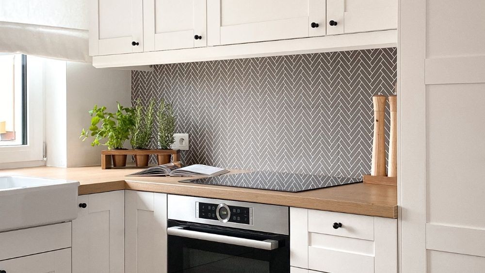
For white kitchen furniture, both light tiles and tiles in shades of gray, pastel pink, beige, or natural stone effects are ideal. These options keep a white kitchen fresh while avoiding a sterile feel.
Wooden furniture pairs best with ceramic tiles in warm tones – from beige to light, soft browns. This combination makes interiors cozier, especially in rustic kitchens or nature-inspired designs.
If you have gray furniture fronts, you can opt for gray tiles in varying depths for a sophisticated tone-on-tone effect or choose a contrast like dark tiles, bottle green, or copper brown.
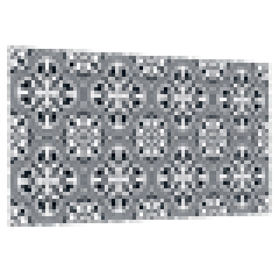
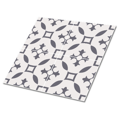
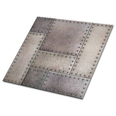
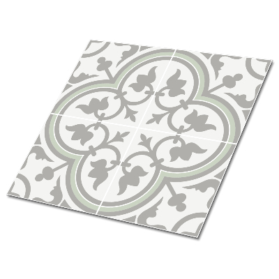
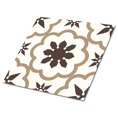
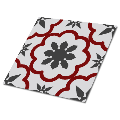
In larger spaces, patterns also work well – they can emphasize the kitchen's character without overwhelming it. In modern kitchens, geometric tile patterns, subtle marble, or textures inspired by concrete are often chosen.
A kitchen that impresses with cohesion
When selecting tiles for kitchen furniture, you're creating a space that will accompany you for years, so it's worth combining aesthetics with functionality. Carefully chosen colors, thoughtful use of light, and materials that suit the interior style will allow you to create a kitchen refined in every detail. Let the tiles not only complement the furniture but also give your kitchen a unique character, making everyday life more enjoyable. With conscious choices, the result will be harmonious, timeless, and simply beautiful.
FAQ – matching tile colors to kitchen furniture
1. How to match tile colors to kitchen furniture to create a cohesive interior?
It's best to consider the kitchen style and furniture shade – light furniture pairs well with beiges and grays, while dark furniture contrasts nicely with lighter tiles. Also, pay attention to lighting, which influences color perception.
2. What tiles go with white kitchen furniture?
For white kitchen furniture, tiles in shades of gray, beige, pastel tones, and marble-effect models work perfectly. These options add depth to a white kitchen without making it look too sterile.
3. What tiles should I choose for gray kitchen furniture?
Gray furniture fronts go well with either light tone-on-tone tiles or contrasting colors like bottle green, black, or graphite. The choice depends on whether you want harmony or a bold accent.
4. Are dark tiles suitable for a small kitchen?
Dark tiles can work in a small kitchen but should be used sparingly to avoid overwhelming the space. Lighter shades are a better option to visually enlarge the room.
5. What tiles are the most practical for a kitchen?
The most practical are ceramic tiles that resist high temperatures, stains, and are easy to clean. Tiles with subtle patterns are a good choice as they help mask everyday wear and tear.